DESIGN SYSTEMS
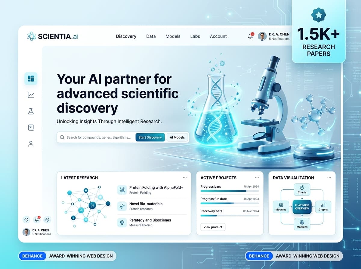
Scalable Figma design tokens, headless React component libraries, and automated Storybook documentation engineered to accelerate product shipping velocity and guarantee UI consistency.
HOW WE SOLVE PAIN POINTS IN YOUR NICHE
As engineering and design teams grow across multiple squads, visual inconsistencies, duplicated UI code, and brand fragmentation become crippling productivity bottlenecks.
We engineer unified design systems that bridge the gap between design and engineering. By pairing semantic tokens in Figma with production-ready React component packages hosted on npm or private registries, we empower your teams to ship features 3x faster with guaranteed visual fidelity.
SPECIALIZED CAPABILITIES
End-to-end technical scope engineered for deterministic quality and zero vendor lock-in.
Design Token Architecture (Color, Spacing, Typography)
Hierarchical token structure (Global, Semantic, Component) formatted in Style Dictionary for instant export to CSS, iOS, and Android.
- ✓Figma Variables & Token Studio Hierarchy
- ✓Style Dictionary Automated Multi-Platform Export
- ✓Semantic Color, Space & Typography Token Specs
Headless Accessible Component Libraries
Production-ready React/TypeScript components built with headless primitives (Radix UI) and Tailwind CSS with full keyboard and screen reader support.
- ✓50+ Atomic & Molecular React Components
- ✓Zero-Runtime-Overhead Tailwind Architecture
- ✓100% WCAG 2.1 AA Keyboard & Screen Reader Compliance
Storybook Documentation & Interactive Playgrounds
Public or private Storybook portals where designers, developers, and product managers can test component states, view code, and copy snippets.
- ✓Interactive Storybook 8 Deployment
- ✓Automated Props & Args Documentation
- ✓Dark Mode, Viewport & Motion State Toggles
Figma-to-Code Automated Sync Pipelines
GitHub Actions pipelines that listen to Figma variable updates and automatically create pull requests updating CSS variables in your code repositories.
- ✓Figma REST API & Webhook Integrations
- ✓Automated PR Generation on Token Changes
- ✓Versioned Token Changelog & Semantic Versioning
Multi-Brand & Theming Governance
White-label architectures allowing your application to switch brand themes, colors, and border-radii dynamically with single token updates.
- ✓Multi-Brand Theme Providers & Contexts
- ✓Instant Tenant Rebranding Capabilities
- ✓Dark / High-Contrast Accessibility Themes
Legacy UI Component Audits & Consolidation
Deep audit of existing codebases to identify duplicate buttons, modal patterns, and hex colors, consolidating them into unified system components.
- ✓Component Redundancy & Debt Audit Report
- ✓Deprecation & Migration Code Runbooks
- ✓Codemods for Automated Component Replacement
OUR PROCESS AND ITS BENEFITS
Phased methodology designed to maximize speed to market, organic performance, and architectural longevity.
UI Inventory & Component Audit
We catalog every button, form element, modal, typography style, and hex color across your applications to expose fragmentation.
Token Taxonomy & Scale Definition
We establish mathematical spacing scales (4px grid), fluid typography ramps, and semantic color palettes (primary, surface, state).
Core Component Development & Storybook Setup
We build foundational atoms (buttons, inputs, badges) and compound molecules in Storybook with unit tests and accessibility verification.
Visual Regression Pipeline with Chromatic
Connecting Chromatic to your pull requests ensures that modifying a button component cannot accidentally break forms on other pages.
Package Publication & Team Onboarding
We publish the component library to your private npm registry and run interactive training workshops for your engineering and design teams.
HOW WE WORK
Deterministic sprint milestones, production-ready codebases, and zero surprises.
Audit & Architectural Strategy
Catalog existing design assets, align on technical requirements (React/Tailwind/CSS Modules), and define component roadmap priorities.
Token System & Foundation Build
Construct semantic Figma tokens, build Style Dictionary pipelines, and set up the core monorepo and Storybook environment.
Component Library Engineering
Iterative two-week sprints building and testing accessible components, documentation, interactive stories, and unit tests.
Deployment, CI/CD & Migration Support
Publish private npm package, configure automated Chromatic visual tests, and assist your developers in migrating production apps.
FEATURED DELIVERIES
Explore how we have engineered measurable outcomes for startups and market leaders.
Prism Global Component Registry
Unified design system powering 6 enterprise SaaS applications across 4 product squads, slashing front-end feature cycle times by 68%.
Horizon Multi-Brand Design System
Token-driven design system enabling instant white-label branding for 12 regional bank portals with 100% WCAG 2.1 AA compliance.
CareTokens Atomic Component Suite
Accessible React component library and Figma UI kit utilized by 35 engineers, reducing duplicated CSS and styling debt by 80%.
WHAT WE USE FOR DESIGN SYSTEMS
Curated tools, frameworks, and modern infrastructure engineered specifically for our Design Systems deliverables.
CLIENT VOICES
Direct feedback from founders and engineering leaders who partnered with us for Design Systems deliverables.
The Pagal Engineers delivered an exceptional web platform and digital portal for our students and prospective admissions. The site is fast, modern, and perfectly captures our creative academy brand. Student inquiries and course enrollments increased noticeably within weeks of launch.
Working with The Pagal Engineers transformed our digital presence. They engineered a sleek architectural portfolio and client inquiry engine that showcases our luxury interior projects with zero lag. Our consultation bookings and client reach expanded significantly.
The Pagal Engineers built an exquisite, high-performance digital store and runway showcase for our fashion label. The sub-second speed, seamless checkout experience, and elevated visual aesthetic have drastically improved our brand engagement and customer delight.

The Pagal Engineers engineered a high-velocity creator discovery and campaign analytics platform for Influenciz. The real-time metric sync, sleek dashboard interface, and sub-second load times have allowed our brand partners and creators to collaborate effortlessly.
The Pagal Engineers delivered an exceptional web platform and digital portal for our students and prospective admissions. The site is fast, modern, and perfectly captures our creative academy brand. Student inquiries and course enrollments increased noticeably within weeks of launch.
Have Questions?
Need technical clarity on our Design Systems deliverables, timelines, or architecture? We’re an open book.
FREQUENTLY ASKEDQUESTIONS ANDANSWERS
FREQUENTLY ASKED QUESTIONSAND ANSWERS
EXPLORE COMPLEMENTARY CAPABILITIES
FRONTEND DEVELOPMENT
Ultra-responsive, type-safe web interfaces engineered with React 19, Next.js 15, and Tailwind CSS — built for sub-second Core Web Vitals, fluid micro-interactions, and flawless cross-device fidelity.
PRODUCT DESIGN
Intuitive product design, cognitive dashboard UX, and interactive design prototypes crafted for complex AI platforms, enterprise SaaS, and high-conversion customer applications.
REDESIGN
Transform outdated, high-friction websites into modern, hyper-fast digital flagships without sacrificing existing search engine equity or historical data.
READY TO SCALE YOUR DESIGN SYSTEMS?
Let's turn your high-stakes technical vision into a production-grade digital platform. Reach out today for an engineering architecture consultation.